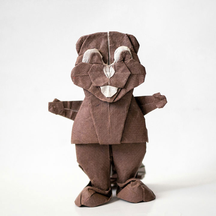
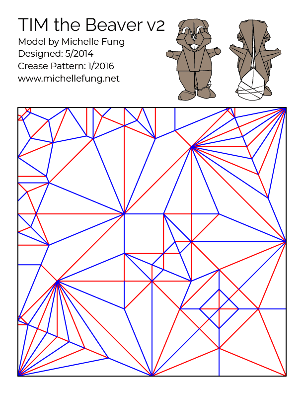
TIM the Beaver v2
(MIT's Mascot)
| Designed | May 2014 |
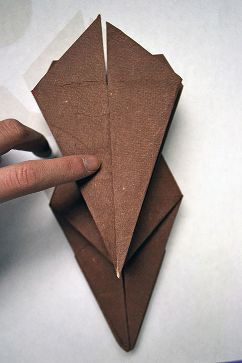
| Crease Pattern | Yes |
| Diagrams | |
| Inspiration | 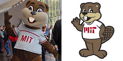 |
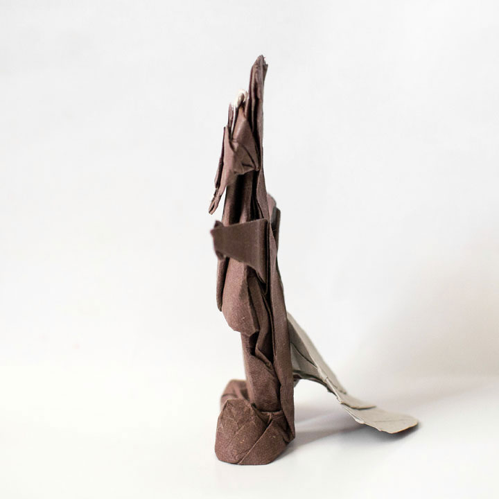
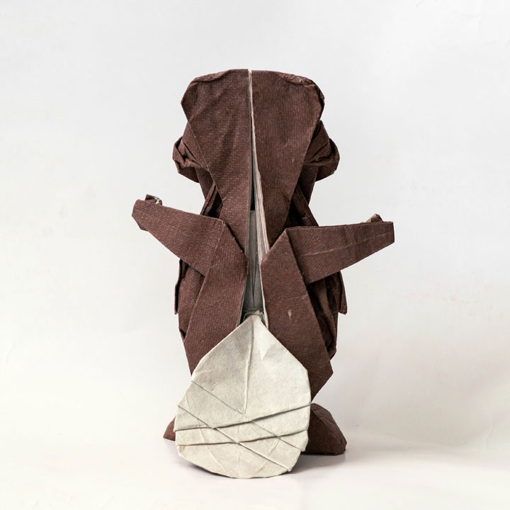
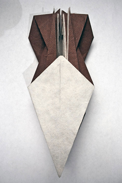
After 3+ years, I finally redesigned my TIM the Beaver v1 model. Compared to the first version (from 2010, see TIM the Beaver v1), this version is more efficient, easier to fold, better designed overall, and folded from higher quality paper (Origamido paper reserved for TIM the Beaver v1's redesign for ~3 years). Also, unlike v1, v2 can stand up by itself! Finally, TIM the Beaver v2 has the more cartoony proportions appropriate for a school mascot character, as opposed to my previous origami representation of TIM, which had a too-small head and too long and thin limbs.
During the redesign, I paid particular attention to reducing the wasted paper usage around the ears and belly area of the old model. As a result, the v2 model retains the aspects I liked from the v1 model (e.g., the face and tail) and strips away the excess paper between the features. The difference in the crease patterns for v1 and v2 reflect this.
The year 2014 coincides with TIM the Beaver's 100th birthday - TIM the Beaver was born as MIT's mascot in January 1914. This model serves as my present to TIM the Beaver. Happy 100th Birthday, TIM!